Thursday, September 30, 2010

Idea #11: The Connected Athlete

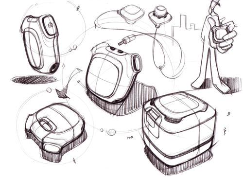
GameSpeed is a concept that I've been working on for quite a long time but it just resurfaced as I learned about how far along the enabling technology has come. The goal is to create a community around spirited competition, shared goals, challenges, and training programs for current and former athletes. Users will have a lightweight necklace (similar to a Phiten in form factor) that automatically transfers data to their computer (and corresponding online account) as they pass near their base station, likely after a workout. A couple key requirements here: (1) Product must require very minimal effort to upload data and that (2) data should be presented very simply, with opportunity to explore for greater detail.

As a former college football player at Tufts University, I can say first-hand that the players and coaches will work for any possible edge they can get, from offseason training to in-season game preparation. However, athletic performance improvements are still measured by coaches with stopwatches, the same technique that's been used since Vince Lombardi was on the sidelines. Instead of that, this "Connected Athlete"  system would allow coaches to create gameplans that are optimally strategized for the strengths and weaknesses of specific players. For instance, certain pass patterns may be perfect for one player with exceptional agility but poor top speed, while another player with better top speed and poor footwork should get a different pattern. Sure, this is an obvious example that is possible through traditional coaching and evaluation, but in many cases it's not. How do you keep track of a player's performance trends during a game? or during a season? This type of system would enable all of that.

Users:
- Current Athletes (Youth, High School, College, Beyond)
- Former Athletes
- Coaches
- Scouts
- Personal Trainers

Recommended Capabilities: 

- Track speed, acceleration, and endurance
- Compete in challenges for prizes
- Compete against teammates
- Compete as a team
- Scout and compare future players
- Evaluate current players
- Work remotely with personal trainers
- Monitor off-season training


Wednesday, September 29, 2010

Idea #10: MediPlate

As part of Hiroshi Ishii's Tangible Interfaces course at the MIT Media Lab, I have spent the past few days studying home healthcare and the opportunities for new technologies. I have been specifically interested in learning about the perspectives of the elderly in this country and their views of home care and supporting tech. Here's my first concept of a tangible interface to support home care..


Monday, September 27, 2010

Idea #9: Searching for Conflict and Finding Greener Water

This past spring, while taking Professor Eric Von Hippel's User-Centered Innovation course at MIT Sloan, my class was lucky enough to learn from a fascinating guest lecturer, Continuum CEO Harry West. One of the key lessons I took from Harry’s presentation was the critical importance of discovering contradictions or conflicts in a market. By studying customer behavior and the various ways they interact with products, one can identify if there is a mismatch or conflict between what industry has provided them and what they really want. This identification of latent needs through conflict recognition is a powerful concept that enabled Continuum, on behalf of Procter & Gamble, to discover the contradiction of people wanting their floor clean but not wanting to deal effort do it. This insight (along with the insight that people were spending more time cleaning their MOP than their floor) led to the design of the Swiffer, a widely successful home-cleaning product produced by P&G. Not surprisingly, it also tapped into the fact that people will give up some level of quality or performance if a product helps them save time or makes their life easier.

So, this brings me up to today where I had a great conversation with an entrepreneurial friend of mine from college, Josh Glicksman. Glixy’s idea, which we quickly hashed out together, taps into a set of conflicting insights in American society today: (1) Water is beneficial for your health and should be consumed throughout the day, and (2) Production and disposal of plastic bottles is harmful to the environment. Now, knee-jerk reaction would be that everyone should just use water bottles and fill them at the water fountains or taps, right? If filling up on tap water is such an easy solution, then why did the global rate of water consumption quadruple from 1990 to 2005? On top of that, it’s estimated that people will consume 174 billion liters of water in 2011, a 51% increase from 2006. (http://www.worldwatch.org/node/5475). Consider that, an industry worth billions that banks on the fact that people will pay for a product that they can get a slightly warmer and slight less quality version for free. Sounds like an opportunity…

What if we could promote the healthy habit of drinking water while simultaneously reducing consumption of plastic bottles? Is there is a way to capture market share between no-cost tap water drinkers and the high-cost bottled water drinkers? To capture the tap water market, you would need to provide water that is as convenient as tap water but at a higher quality (e.g. colder!). Meanwhile, you would have to provide the bottled water drinkers with a product at comparably high quality, much cheaper price, and a heavy helping of guilt for what their plastic bottles are doing to the environment. After all, why are we paying for the bottles if all we want is the water?

Thus, an innovative water service concept is born (nice work, Glixy). Consider a water kiosk set up on campuses that is hooked into the tap water system, but utilizes refrigeration and a reverse osmosis system (after wall, temperature may be the biggest factor in perceived water quality). Students carry a pre-purchased water bottle that features a barcode associated with their student ID. Students may have purchased a premium water bottle for a high cost (say $40) that gives them unlimited water or use a “pay as you go” system where the kiosk charges their student account a very small amount (e.g. $0.40) every time they fill up their bottle. You could even imagine the simple addition of flavor packets available at the kiosk at a small price (e.g. $0.10).

An interesting aspect of the ID-to-bottle connection is that it would tap into the growing trend of people tracking their life statistics (e.g. FitBit, every iPhone running app, calorie counters). This system would enable someone to track the water they are drinking, say on a mobile app, as they move around campus throughout the day, filling up at different kiosks. Perhaps you could even add incentives for people hitting certain individual or collective water-drinking goals. For people who are averse to paying for water, this service might actually be a worthy benefit.

With this system, we would add a measure of convenience and cost-savings to the water bottle drinkers (no more waiting in line in the store), add a level of quality to the tap water drinkers (cold filter water), and most importantly, offer a service that is mutually beneficial at the personal (health) and global (environment) levels, thus eliminating the contradiction in the market.

Thursday, September 23, 2010

Idea #8: Circle of Life

An MIT classmate of mine, Matt Harper, presented an interesting concept to me over a beer at The Muddy a few months ago called "Circle of Life". We discussed and matured the concept over a couple beers and I think it's worth sharing here. The concept is about using technology and digital computation to enhance our lives in the real world, a theme which I have been driving towards in my posts lately.

The concept is this.. we're all walking around every day with device in our pocket that can help sense, record, photograph, capture, and geolocate the world around us and our activities within it. What I would really enjoy using is a simple "invisible" smartphone application that is purely about capturing a moment into a digital timeline of a life. By invisible I mean that you wouldn't have to spend a second of time interfacing with the application - just take the picture and continue with what you're doing.  What I'm talking about here is much less Facebook and much more a location-aware time capsule. It's about utilizing technology to enrich the memory of our experiences, and not using it for a distraction from them.

Consider leaving an audio message from a kid every year on his birthday, something that persists across devices and does not get lost in the clutter of comments and drunken photos. Or, what I think is even more interesting, capturing an important event at a specific location and it only gets discovered when your family or friends (real ones, not Facebook connections) passes through that spot. Consider what that would mean to someone 20, 30, or 100 years from now. I could see wanting to develop a range of visual narratives for the different phases of life, such as work, school, etc.


Friday, September 17, 2010

Idea #7: The Art of the Game

I would like to continue on a theme from my previous entry and develop further concepts that can be defined as "ambient" interfaces. Specifically, I've been thinking about ambient interfaces and the implications they have on product development processes. So, the method is this: Think about your critical informational needs and develop and "invisible" interface to convey them.

Step 1: Determine your information need
So there's the easy ones, like weather, traffic, and of course, the time. after that, you have personal quantifiable informational needs, such as savings account totals, calories consumed, calories consumed, energy consumed, time worked across projects, or a million other like these. however, I'm going to push off all of these important informational needs to stick with a favorite of mine: baseball scores

I'm a devoted Red Sox fan and love tracking the team throughout the course of a season. However, watching every pitch of all 162 games of a season is just not practical when I'm busy or there's other things going on. I would love the ability to simply track the Sox score on a given day via a glanceable interface. If it looks interesting, say a 2-2 game in the 7th, that will prompt me to turn it on. So, here are the info needs: inning (with top or bottom), runs/hits/errors for home and away teams, and a attempt to show runners on base.

Step 2: Develop an "invisible" ambient display of Step 1 results

The challenge here to create a product that presents information into an environment in a subtle and non-intrusive manner. In the words of legendary designer Hiroshi Ishii, these ambient interfaces should be "calm" and "seamless with the environment". it should be glanceable from a distance, and almost invisible if you did not know what it was.

In regards to our baseball concept, I would like the form of the product to be inspired by baseball, but not explicity use any cues from the game. For instance, it would be too easy to have a scoreboard, a diamond, or a ballpark. It should look like a normal piece of art hung on a wall that changes in subtle ways as the game progresses. I would like to use some of the materials, textures, or colors from the game, but that's a real challenge because I want to avoid it looking like something that belongs in a cheesy sports bar.

Concept sketches to come soon...

Tuesday, September 14, 2010

Idea #6: See Me Outside

Just last week, I began taking a Tangible Interfaces course under the legendary Hiroshi Ishii, head of the Tangible Media Group at the MIT Media Lab. We spent our first class period learning about the concept of "ambient interfaces", products that augment an environment by unobtrusively conveying information, often with abstract visual representations. Many of the concepts created by those in the Tangible Media Group are endlessly fascinating and beautiful.

During our group breakout sessions, we needed to develop as many concepts as we could that could be designated as ambient. One idea that I'm particularly interested in is this "See Me Outside" concept.

The idea of the product concept is to have a photo frame that dynamically displays your photos that map to the corresponding weather of the day, or even the current level of daylight. There's an interesting meaning to the product as it taps into your emotional memory that already associates current weather conditions with past experiences. While photos themselves are nothing novel, using them to convey information about the weather just might be. After all, do you care about the specific weather details or just whether you'll need an umbrella?

Wednesday, September 8, 2010

TReil & Error Design Principles

1.      A product’s design cannot be defined as simple until the user perceives it so. 
2.      Allowing user complaints and recommendations to drive new requirements will only lead to minor improvement, not true innovation
3.      Forget the debate. Form and Function should be seamlessly integrated. 
4.      A product's perceived primary function and overall purpose is put at risk as the complexity of the product's architecture is increased.
5.      The design and development of a product will always extend longer and contain more errors than expected. Plan accordingly.
6.      Prediction of the future is impossible. It is necessary to plan for a range of potential adjustments that align to plausible future states.
7.      People are self-interested by nature. Don't show them how great your product is, but instead show them how great they'll be with your product.
8.      Once people progress beyond basic needs, they seek out meaning in the products they purchase. Showcase the purpose within a design.
9.      Where there is redundant form or function across a product line, there is opportunity for modularity in the architecture.
10.  People inherently reduce pain, discomfort, or uncertainty. Create natural and intuitive user interfaces if you want people to use your product. 
11.  Technologies are almost always combinations of, improvements upon, or re-applications of other technologies. They are rarely invented.
12.  The product’s life extends beyond its original use. Design for recycle, alternative use, or decomposition.
13. Prototype, prototype, prototype... you can't truly understand your ideas without making them tangible first.
14. Good design is useful (credit to Dieter Rams for this one).

Tuesday, September 7, 2010

Idea #5: Sketchbook and the Drawing of New Ideas

Background 
As I've discussed in previous posts, I've become increasingly interested in the intersections of products and disciplines and the incredible opportunities that come from them. I could write a hundred posts on it, but I'll save myself the effort (and you the pain) and just point you to an expert on the topic, Fran Johansson, author of The Medici Effect (http://www.amazon.com/Medici-Effect-Breakthrough-Insights-Intersection/dp/1591391865), with a great corresponding blog as well (http://www.themedicieffect.com/blog/.)

Now, here's a hitch that I'm specifically interested in... Clearly, the "Medici Effect" is most prominent when a product, behavior, or discipline is abstracted enough that one can make the connection between it and something else that was previously perceived as unrelated. Doing so often requires the stripping out of "minor" details that stand in the way of innovation-inspiring connections. So, what if we took one step further in the stripping out of abstraction-preventing details? What if you had an open forum of shared hand-drawn, visual, product and business concepts, completely free of text? Personally, I think it would be highly beneficial, especially as it would lead to the always interesting phenomenon of developing great ideas via misunderstanding, a process which they might as well name after me since I take part in it so much.

Idea: Sketchbook
Enable designers, artists, and concept developers to take greater advantage of the Medici Effect through the power of social web platforms. It would be an online site where people could discover and post sketches of new products, characters, and business models. Before you react and think "hey, no one will want to just give away their ideas!", just wait.. the focus will be on "idea pieces" - just the random sketches and half-baked business models that don't have a use to you, but might inspire some idea from someone else.
Sketch created by Ben Arent
http://www.benarent.co.uk/bog/category/design-sketching/

Like a Facebook or Twitter, users would be able to subscribe to other artists, innovators, or others idea-makers that interest them. I could see it being great tool for helping people out of creative ruts. In fact, you could even see patent images being posted on here as long as they were properly attributed.

While the focus would be on the visual, people would be able to have side conversations to discuss and form communities around the new ideas.  An interesting aspect here is that I could see it being just as valuable to entrepreneurs developing new business models to illustrators developing new storybook characters.