Tuesday, March 17, 2015

Designing For Wearables: Where To Begin?

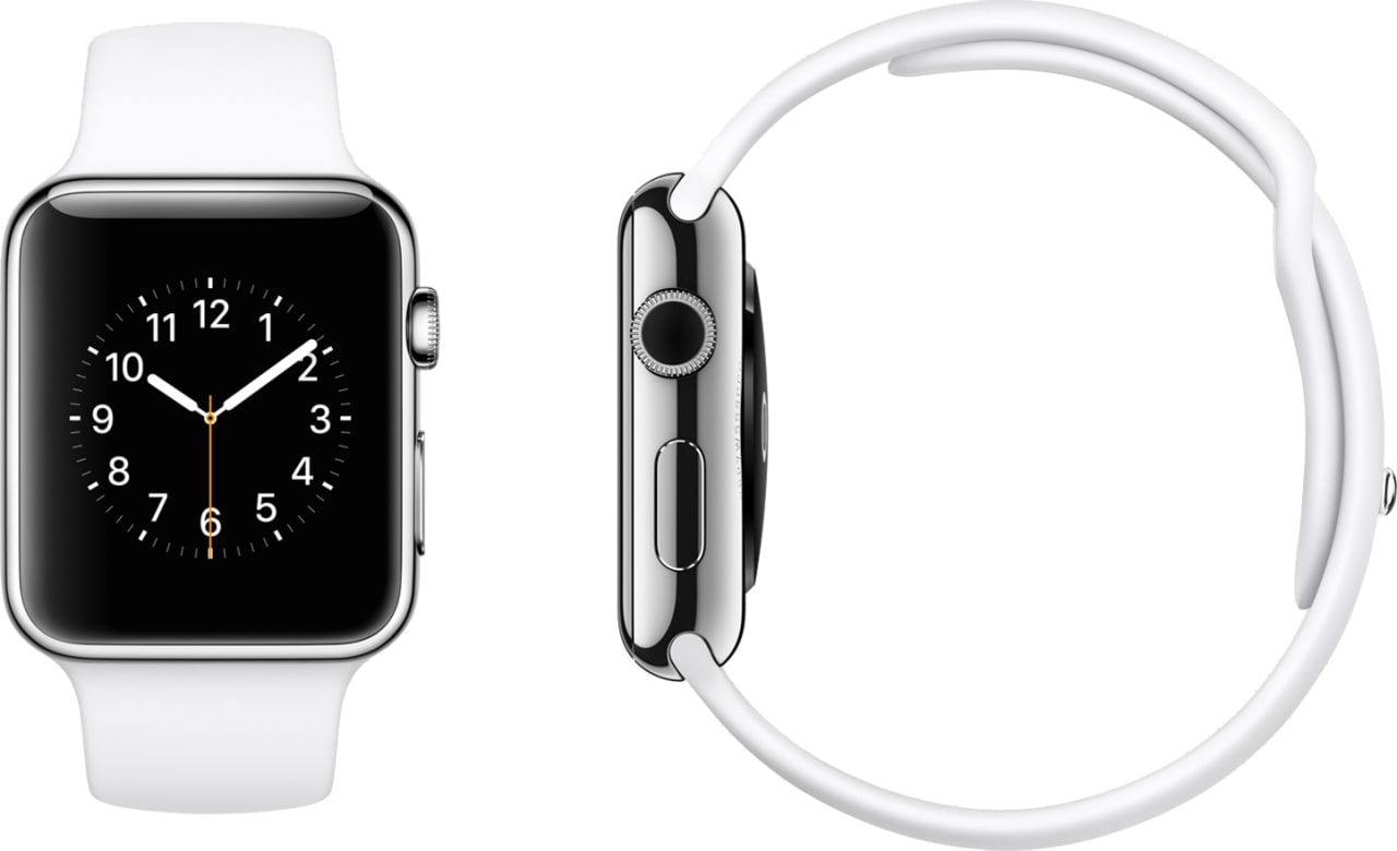
The introduction of the Apple Watch will likely lead to a wave of companies exploring the idea of wearable versions of their products for the first time. This should come as good news if you're a designer at one of these companies. Designing wearable solutions is an invigorating challenge as the devices allow for so many new behaviors and experiences, the standards have not been formed yet, and the technologies are constantly improving.

Since I've been focused solely on wearables for about three years now at APX (www.apx-labs.com), I figured this was a good time to share some of my lessons learned and tips from the field for designing for wearables.

Have a clear purpose.
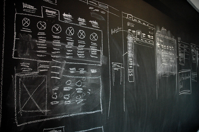
Don't be surprised by a Gold Rush mentality here. Some people are going to be more excited about the idea of creating a wearable app than what the app will actually do. It's your responsibility to hold the train up and make sure it's headed in the right direction. Push for answers on questions like: Why should we create a wearable solution? What will be the concept or the purpose behind it? Will it complement, replace, extend, or simply add to our product? How might it improve the overall product offering? If you're satisfied with these answers, then definitely proceed. If the answers are weak, or you don't share the same views, you may want to stay at whiteboard until you do.


Define your product intent.
Once your purpose is in place, it's time to shift to your users. It is absolutely critical that you have a shared understanding with your product team about the human goals driving your wearable app. You will need to clearly define what you expect people will able to do with this product and how you're going to make that possible. This will surely align with your current product offering, but don't be afraid to look for opportunities to evolve to support new goals and behaviors. The wearable version of your product may provide new value that wasn't possible before.

Some questions that you'll want answered as a team: Why will people use our wearable app? What will they be able to do that they can't do today? Will that improve their overall experience with our product? How will they explain, think, or talk about our wearable app?

Jeff Gothelf of Lean UX gives a much better explanation of the importance of shared understanding than I could. I suggest you check it out.

Re-introduce your user.
I'm sure you've created user personas, conducted interviews and observations, and collected every bit of data that you can find. That's fantastic and certainly won't be tossed out for a wearables project. However, take the time to step back and re-evaluate your users as their experience with your wearable product may be vastly different than what they experience today. What do you expect they'll be doing when they use the wearable version? Walking or running? Perfoming a job? Making purchases or other decisions? Are they alone or is it a social setting? Find the insights that may distinguish your wearable experience from competitors and even your own existing product.

Context is king.
The Android design team over at Google has a great line about designing for context with wearables: "Focus on not stopping the user and all else will follow". It's entirely true. If you've assessed the context of your user, you know where they will be, what they'll be doing, and who they'll be with when they're using your product. This context is much more important with wearable devices than it is with desktop or even mobile experiences. Interactions should be swift and seamless - this includes responding to alerts (which there should be very few), viewing information, and taking actions.

Be driven by behaviors.
It's easy to get caught up in features because they're so tangible. They're the nouns in the product and the bullets on the website. Yet, designing with feature first always leads to disjointed user experiences. It's far more effective to have user behaviors drive your design process. These are the verbs that cut through the product features, describing how a person will go from wanting to do something to having it done. User journeys have been around forever and their value is widely known, so this is nothing new. What is new, however, is the advent of wearables and the only way to enable seamless interaction in context is to favor the verbs over the nouns.

Leave stuff out.
Show me a wearable product that tries to replicate a desktop or mobile experience and I'll show you the Uninstall button. Nobody wants a smaller, more crowded, and harder-to-use version of your product. Use your knowledge of your users to determine only the critical features to leave in and most frequent behaviors to enable. This may require some hard decisions and in-house debating, but I can promise it's worth it. The market won't give you points for replicating your existing product experience but they will reward you for creating a great one.


Manage the big picture
If you're creating a wearable app, it is possible that it is a wearable version of some larger product experience that spans desktop, mobile, or other devices. While you and your team are likely obsessing day and night about this exciting new version of the product, I caution you to not lose sight of the broader perspective. Your shiny wearable version of the product may stand alone just fine, but it's also part of a larger product ecosystem. To your user, it's all one product experience. Make sure that what you're creating complements and extends the existing product. It may even create new opportunities for value on the existing platforms.

...and watch the little picture.
The best way to manage the complexity of a cross-device user experience is to have strong rules and principles that bind the features and devices. It's important to remember that people are usually busy, distracted, and are not experts with your product, so make life easy for them. It's your responsibility to make sure that they're being presented with a simple and enjoyable product experience. Make sure that the rules for interacting with the product are clear, intuitive, consistent, and predictable. If you're not sure what I mean by interaction rules, I highly recommend Dan Saffer's Microinteractions: Designing With Details


Those are my current tips for designing for wearables. I hope they've provided you with a good roadmap as you start your journey. Please reach out to me if you think I've left anything out here as I would like to learn from other people working with these products as well. You can also follow me on twitter (@toddreily) or track the products I'm working on at APX Labs (@apxlabs or www.apx-labs.com). I look forward to hearing from you.

Monday, July 14, 2014

Design: The Horizontal Discipline

Design is a varied thing. Like most people in my role, I can be found doing any number of design-related activities on a given day. However, "design-related" can be be pretty ridiculous adjective. In my small startup alone, Designers are involved in product strategy, feature planning, user research, customer support, marketing, promotion, video production, graphic design, customer support, and prototyping. That short list alone hits on five or six major disciplines, from management to engineering to marketing and everything in between.

I don't code, personally, but many (most?) UX Designers do and can build their own solutions. I also know little about the technical side of graphic design and typography, which many Designers are highly skilled at. However, I have extensive experience and an academic background in Human Factors Engineering (Go Jumbos!) and System Design (go SDM!). Plus, I was an animator, can read a balance sheet, and know a few things about psychology.

Somehow this is all normal. What's the story here? Are we just using overly broad terms for a collection of specific jobs? Or, does the role of product design really require all these skills, and as a result, weave through every other discipline within an organization? I've come to accept and embrace the fact that this is the case - that design is a cross-disciplinary discipline by nature, specifically positioned to cross the seams of other roles and responsibilities. Does this make it less or more important than other disciplines within an organization, such as Engineering, Sales, or Marketing? Not at all - it's just different - a supporting bridge across a row of a pillars. A horizontal among verticals. Like I said, a varied thing. 

Wednesday, February 26, 2014

How to Balance Creativity and Productivity

I work out of one-man office, doing work that requires both creative design output as well as a high level of productivity. My daily work ranges from developing detailed design guidelines to conceptualizing future product concepts. After nearly a couple years of working in this environment (another another decade or so doing similar design work), I thought I would share some of my tips for being productive in a creative role.

Start early
There is no better time to start creative work than early in the morning. You're fresh, your mental energy is at it's highest, and your brain is still waking up. This last part is the most interesting because it's your brain's scrambling to wake that leads to unexpected connnections and creative ideas when you force it into a challenging situation. Most mornings, I get up at 6:00am, make coffee and breakfast and start working from my home office at 6:30am. I always start with my most interesting and creatively challenging work at this time. I find that I'm best ready to handle it at this hour with fresh energy and a new perspective. No one is there to distract you at this time - all the phonecalls, requests, and emails don't start until after 9am - so this morning period is perfect for focus.

Mindmaps
I was sitting in a grad school class in the fall of 2009 when I noticed the guy in front of me typing his notes in mindmap software. I asked him what the program was and he said it was Freemind. I started using it and having looked back since. I literally have ONE mindmap file that contains everything that I've wanted to capture since 2009. Every idea, every fact, every person. Everything is searchable.

shot of the planning side of my mindmap
I can't recommend mindmaps enough. They allow for the best organization of content, quick searching, and work great as a content creation tool. From a creative standpoint, they allow for hyper-focused views where you can open just the branches you're interested in, or a big picture view by expanding many branches. I like to create work queues within each create project that can have a great deal of content nested down to simple one-line notes. Mindmaps are also a great way to store ideas. Revisiting, evolving and combining old ideas is one of my favorite practices.

Definitely give Freemind a test drive. It's the simplest and most flexible of the available mindmap tools. It doesn't run on tablets or run in the cloud, however, so you may want to explore other options if you want this.

Go for a Walk
walking my dogs in November 2013

I'm far from the first person to do this, but I enjoy taking walks when I'm faced with a design challenge. When I'm working at home early in the morning or at night, I take my dogs and head out. This gives me the time to think through a problem and develop solutions out in the fresh air. Being on the move, taking in the surroundings, and simply stepping away from the computer also seems to bring me some clarity.

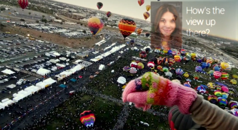
I own Google Glass, which I'll wear sometimes if I have a particularly tough challenge to deal with. I'll use Glass's video recording feature to create video memos where I record notes on the possible solutions. I would never want anyone to actually see these obnoxious videos of me talking endlessly and seeing my dogs walking from behind, but I find them really useful (and I delete them as soon as I jot the notes down). If you don't own Glass, your phone's video feature will work just fine for this.


Work in Creative Batches 
Disruptions of emails, text, and phone calls are an absolute killer when you're trying to lock in on some creative work. For some people, the enticement of Facebook, Twitter, Pinterest or other content feeds present too strong of a distraction. This is just the nature of having the same device for producing as you have for consuming content, including your social content. I try to combat these disruptions by taking control of my schedule and sticking to it. Every day I schedule two or three batches of work, ideally two 4-hour chunks, where I focus without distraction during those stretches. This ensures that at least those important items get done. I then fill in the spaces around these batches with the emails, small tasks, and administrative work as possible.

Carry a Notebook
Field Notes notebooks
Any designer worth his or her salt has to carry a notebook for jotting down random observations and ideas. My favorite physical notebook is the awesome Field Notes brand because they are made well, fit in a pocket, and look great. My favorite digital notebook is Google Keep. I use it for notes and saving any articles that I want to read later. It has less features but is simpler and more streamlined than Evernote. Works across phone, laptop, tablet, etc.

Switch Modes
Notebooks offer a benefit that goes beyond convenience. I've also found that switching context from the rigid, distraction-heavy computer to a blank slate sheet of paper and pen can work wonders when stuck in a creative rut. Switching modes like this during the creative process, both early and often, is an awesome way to keep your creativity on its toes, so to speak. This is hard to do, as it's easy to get buried in a task and forget to step away, but it's always a good idea to switch modes to trigger new thinking.

I try to stick to a rule of not using the computer at 9:00pm - it's a notebook or at least my Wacom tablet after this time. I find it to be a welcome change if I'm burnt out from interacting with the same MacBook all day.

Music
Of course, there's always music. I almost always have music going during the day, hitting every genre under the sun in the course of a week. I try to stick to instrumental music to help focus, which for me can range from jazz and classical to electronic. I get every penny's worth out of my Spotify subscription. It allows me to constantly be exposed to new music that can trigger new ideas and perspectives.


For me, all these practices work together to create the best working environment that I can come up with. I hope some of these tips will help you in your own creative work. Please write if you have any ideas of your own.  

Tuesday, October 29, 2013

Design Principles for Smart Glasses (Revisited)

I've been designing for smart glasses for over a year now, including Google Glass and similar products that will be on the market in 2014. I posted my design principles a year ago, but I've evolved them as we've learned from the platform. Here they are: 


Less is More
This commonly seen design principle is never truer than with smart glasses. When you are dealing with a person’s line of sight, you need to take extreme care with every design decision. It’s easy to add features and information, but much harder to take them away because it requires a true understanding of your users and their priorities.
In the design of Skylight, we took extensive measures to drive our user interface down to the absolute minimum while still optimizing its value. Given the industrially oriented environments that we are designing for, we know it is more important to create a minimalist and usable interface than a flashy Iron Man-like interface. This type of thinking led to our Northstar interface, which nests content and features into tiny, unobtrusive virtual points of light. The result is an interface that is almost invisible at times, only revealing itself as the user commands it to.
Don’t Make People Change
Smart glasses are an entirely new type of device. There are no design standards, customer expectations, or market leader to align with. We have no choice but to break new ground and a learning curve is unavoidable.  This doesn’t mean, however, that we have make people change how they behave. We know that if we want to create a usable product, we need to begin with the way that people already act, and design against that.
Very early in our process, we examined common human behaviors, such as how people use mobile devices, write in notebooks, look around their environment, and interact with each other. These everyday activities influenced our design decisions on a daily basis. The result is a product experience that is so unlike anything that’s come before it, yet still familiar. For example, our Northstar head-tracking user interface is based on the concept of visual scanning, the pattern of visually examining an environment for relevant information before focusing in. Actions are then taken by gazing on virtual objects that toggle on and off like light switches. If you know how to look around a room, you know how to interact with Northstar. No hand gestures to learn, no voice commands to remember.
Design for Daily Use
We’ve seen some truly amazing technology demonstrations through the years at conferences and trade shows. If you could step in our R&D lab, you would be floored by the technical feats that our team is capable of. But, we don’t design for demos. We design products for real people to use every day in the workplace. We need to prioritize human factors, like usability, fatigue, and error prevention, in place of more eye-catching features like spinning 3D models with swiping gestures. It was this set of priorities that led to our use of head tracking for interaction. Physical gestures would become far too tiring during a standard work shift and voice input is simply not viable in many industrial environments. Alternatively, head tracking requires so little effort, both physically and mentally, that it emerged as an obvious fit for enterprise scenarios.
Distinguish Glasses from the Real World
One of the advantages of a stereoscopic display is that we can project user interfaces as if they were overlaid on the real world. There are still needs, however, for information to be projected as if it were fixed to the user’s glasses, like a personal heads-up display. In our system, the real world interfaces are designed for interaction using head movements while the personal heads-up display is more “read only” for awareness and notifications. The challenge from a design standpoint is offering the user proper distinction so they immediately and intuitively understand what is a real world element is what is fixed to their display.
We addressed this challenge with slight variations in the design language between the 3D real world and the 2D heads-up display. In our system, real world interface elements have rounded corners and options are primarily circular, offering the intuitive design affordance of a button. This rounded look also blends better into the organic real world. Elements on the 2D heads-up display, by contrast, consist primarily of straight lines and hard angles. This creates a flatter, more prominent, and more “techno-centric” look that is a better fit for a heads-up display. While the edges and shapes may vary, however, the two styles use the same color palette, typography, and other visual cues. The result is a cohesive user interface that exists in two dimensions, resulting in a learnable and usable product experience.
Make a Commitment to Glasses
People will use smart glasses for a reason. Maybe they’re a “desk-less worker” where they want their information in the context of their workplace instead of tied to a fixed location or device. Or, maybe their hands are tied up, carrying packages, using equipment, or treating patients. For these people, we needed to design a completely hands-free user experience. After all, if you need to swipe and tap with your fingers to interact with your glasses, you might as well use a smartphone or tablet.
We made a commitment right from the beginning to “go all in” on glasses. That meant that every behavior, from calling a coworker to taking a picture, needed to be supported without the need for physical interaction. Even our Settings and Registration interfaces are hands free.  We believe this was the right choice for our customer base – people that may be wearing gloves, working in sanitary (or unsanitary!) environments, or simply want the most efficient experience possible.
Provide Convenient Access to Secondary Features
We were presented with a design challenge at a very early stage in the development process. Our Northstar and HUD interfaces worked perfectly together, but it was an incomplete system. What if someone wanted to make a video call, take a photo, or modify user settings? We needed a way to support secondary behaviors quickly and conveniently without obstructing from the primary experience.
We first came up with a concept we called the “personal space” – named for the area below the field of view, close to body, usually reserved for items of personal attention (mobile devices, notebooks, magazines). We figured this to be a natural placement for our configuring and accessing additional content. As we experimented with the technology, our thinking evolved and we learned that the most convenient placement for our menu system was actually above the field of view instead of below. So, we created a truly unique menu interface that is nested just above the user’s normal line of sight. By simply glancing upwards and gazing upon the menu icon, the user is able to open and access a range of hands-free smart glasses features, such as Messages, Contacts, and even a Camera.
Design for Varied Environments
Transparent displays present a significant design challenge as you have no way of predicting what is going to be behind them. Some of our users will be in sun-filled work sites while others will be in dark warehouses. Still others may be moving between the two. We needed to design an interface that could handle these varying environments without any action necessary on the part of the user. We addressed this need by designing a high contrast interface that always presents bright white against dark blue at strategically varying transparencies. As an example, the reticle at the center of the display (i.e. the cursor for head tracking) is a bright white ring that shows up in any normal condition. When looking into a bright environment however, the white ring becomes less apparent and the reticle’s dim blue inner ring visually emerges. Getting these small design details right makes for an interface that can stand up to any condition.
Keep it simple
Since this is such an early-stage technology, everyone that uses our product is going to be a novice to some degree. We have been careful not to overwhelm our users with overly complex rules, difficult to learn interactions, or unnecessary features. The bottom line when designing this type of system: keep it simple.
We have established basic design patterns within our system that we use repeatedly to create an easily learnable and predictable user experience. We have minimized the amount of menu types, buttons, or other interface elements to ensure that people only need to learn a couple things in order to understand the whole system. We have also limited the amount of text, relying instead on familiar graphical icons and visualizations for fast recognition. Finally, we have adhered to a simple color palette that features just a handful of colors that consistently convey specific meanings. The end effect is a perception of simplicity despite the unfamiliarity of this new product paradigm.
Delight
Work is difficult enough for most. They may have long work shifts, hazardous environments, or be faced with endless stress. Utility and usability are our top priorities when designing for these people, but we still believe in the importance of creating an enjoyable product experience as well. While designing Skylight, we took opportunities to design interfaces that were so intuitive that they create a satisfying experience when interacting with them. For example, our lists views can be scrolled like a wheel simply by looking towards the top or bottom of the list. You have never experienced an interface like this before, so the result is honestly fun. We have also designed subtle animations into the interface, such as info panels that slide in-and-out or points of light that animate open like clovers. The intended effect is an interface that seems life-like and interesting to interact with.

Saturday, June 8, 2013

Startup Lessons from Teddy Roosevelt

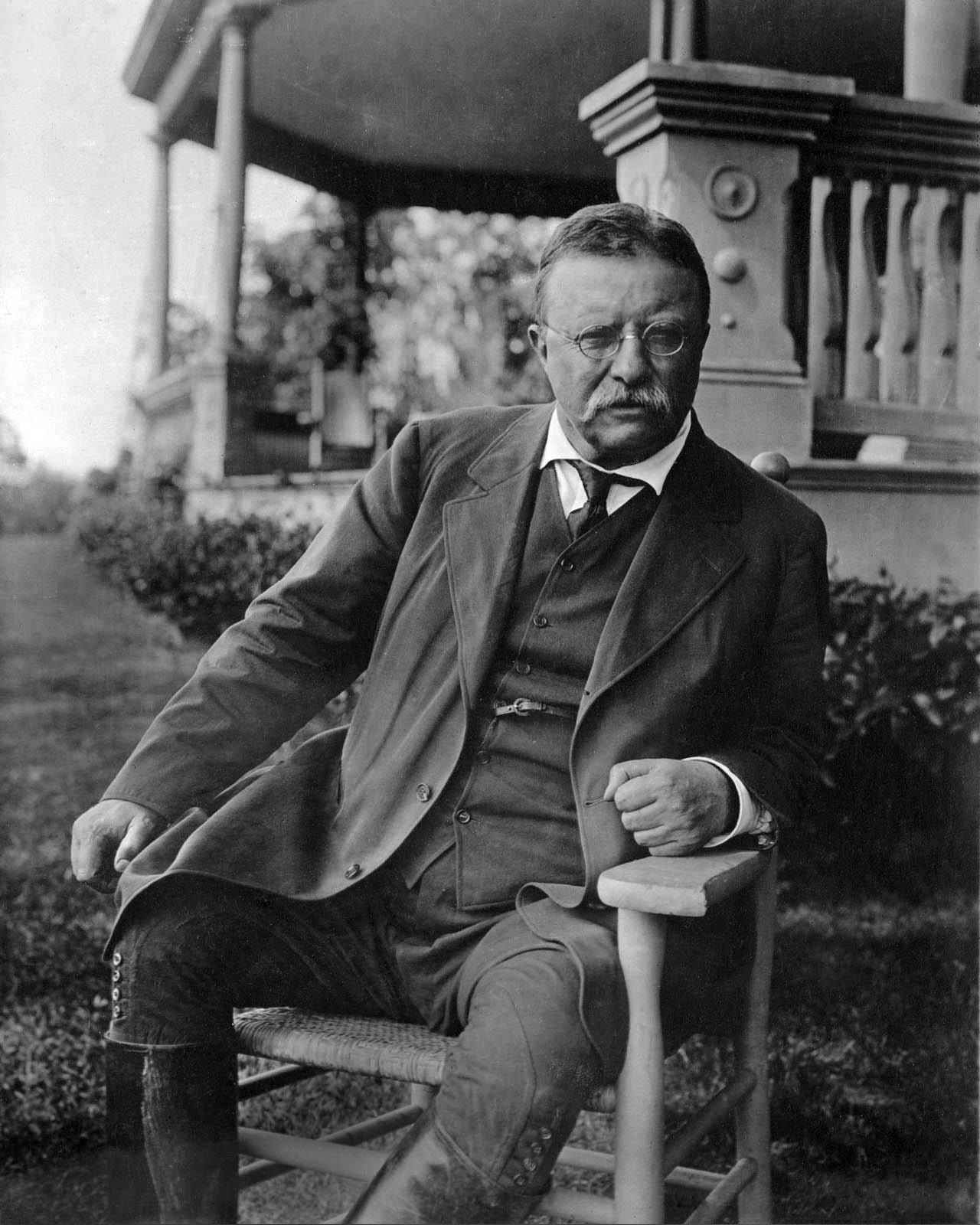
On April 23, 1910, Theodore Roosevelt gave a speech in Paris entitled "Citizenship In a Republic". You probably aren't famliar with entire speech, but you're likely heard an exerpt of it. This passage is titled "The Man in the Arena". It goes as follows:

"It is not the critic who counts; not the man who points out how the strong man stumbles, or where the doer of deeds could have done them better. The credit belongs to the man who is actually in the arena, whose face is marred by dust and sweat and blood; who strives valiantly; who errs, who comes short again and again, because there is no effort without error and shortcoming; but who does actually strive to do the deeds; who knows great enthusiasms, the great devotions; who spends himself in a worthy cause; who at the best knows in the end the triumph of high achievement, and who at the worst, if he fails, at least fails while daring greatly, so that his place shall never be with those cold and timid souls who neither know victory nor defeat."

I've always liked this quote. I've had a framed hand-written version of it hung on my apartment, office, or home office wall for years now as I've seen it as a good reminder of the importance of hard work and resilience.

Something recently occurred me, however, which is that this passage applies just as well with my work. I'm fortunate enough to work in an environment where my face is not "marred by dust and sweat and blood" but it doesn't mean that there aren't lessons to take from The Man in the Arena.
If you're involved in creating products, particularly if you work at a startup, you know that every day is a test of devotion and resilience. Sure, it's not threat of pain or test of physical endurance, and frankly, the challenge of technology product development is fun if it's your passion. However, that doesn't mean that it's not a measure of continued dedication towards a cause in the face of competition, doubt, and disappointment.

We work in the unknown. We create solutions that we believe will solve important problems when they go to market. We create products that we hope people will want, buy, or need. We aim to make people's lives better. We walk into our offices and start up our computers every day knowing that the ideas and decisions that follow could be the different between success and failure.

With that, I want to give credit to those who push the ideas forward. I'm talking about any person in any role who has the will to put new ideas out there. Credit goes to the whiteboard sketches, the "programmer art" in MS Paint, as well as the pixel-perfect UI mockup. Credit belongs to the people who are willing to put their reputation on the line, to potentially be proven wrong, by putting new ideas into the world. Credit belongs to the person who steps up to the board and says "what if we did it this way instead?".


Everyone in the startup world knows the importance of prototyping ideas, of experimentation and design iteration, and changing course when defeat is apparent. Ideas are the fuel that powers this engine. We need more people pushing forward and less pushing back. Pushing forward, learning and adjusting course will always win out over over-planning and early negativism.

Of course, we need planning, we need decision-making, and most importantly, we need the "doing" that gets things done. This is all a given. And true, we also need some critique - a good measure of skepticism - but too often this becomes the norm in organizations. This is just people playing it safe and protecting themselves from their fears. It's easy to sit back, to never risk ridicule or reputation, by always pointing out the faults and risks of the work of others. An organization overrun with critics is one where new ideas are welcomed with pessimism and disdain. The result is that the ideas stop coming and the "timid" company pushes forward without knowing "victory nor defeat". I've worked in an organization like this and I can assure you that's a safe but unmotivating existence.


So - push forward. Be the person who steps up to the board and says "how about this?" and proceeds to draw a new future. It doesn't matter what your role is or how creative you think you are. We need more people striving, more people willing to stumble, and more people risking defeat in a worthy cause. We need more people in the arena.  

Thursday, March 28, 2013

Why Structure is the Secret Weapon of Great Design Teams


So you're sitting at your desk in the morning addressing some leftover emails from last night when a message pops up that you're needed in the main conference room. A major client opportunity has come up and the Design team has been asked to whip up some creative concepts. You head to the conference room, sit down with your fellow creatives and the brainstorm begins. After a couple hours of tossing ideas around, the whiteboard is full of ink, including a great sketch of a user journey and a list of a few potentially killer concepts. The meeting ends with you agreeing to document the ideas with the help of some rendered storyboards from one of the better artists in the group. The team will have the new concepts ready for review by the end of the week. Design has delivered. 

This is the model that exists in so many organizations, and it can work just fine. Creatives free of soul-dampening process, temporarily unhindered by reminders of budgetary and technical limits, creating wildly divergent solutions for their less creative counterparts to develop.  

The underlying wisdom is (1) unstructured creative "magic" generates ideas, and then (2) structured engineering process makes the idea of a reality. As far as creating great products, however, it is completely flawed.

The reality is that an unstructured creative process (I'm talking more idea generation than detailed UX design) bounces randomly around the problem and solution spaces, undoubtedly spending too much time on some aspects while accidentally ignoring others. This random approach MAY result in a great outcome, but it's not efficient or reliable as a process.

5 Reasons Why You Need More Creative Structure

1. Trust
If you're a designer, I'm sorry to tell you this but your co-workers don't trust you. They have process and structure. You have whiteboards and brainstorms. They're quantitatively-driven, and you're.... not. By cloaking the creative process and being exclusive, you're creating an unknown that will lead to an uneasiness from people who are not familiar with it. If you want to establish credibility with non-creatives in your organization, you need to have a transparent creative process with a level of rigor that is understood by roles which are traditionally more structured and process-oriented. Otherwise, your work is just "magic" and it will never really be trusted. Sure, you might maintain some of the mystique of being an exclusive design department, and you may generate some fantastic design concepts, but the influence of those concepts will never be fully realized without a considerable level of trust in how they were created. 


2. Ideas
An odd relationship exists between structure and creativity. Bad structure can create a negative environment where brainstorms become more about avoiding constraints than achieving optimal solutions. Good structure can provide a "creative scaffolding" where problems can be more fully understood and the full range of solutions can be explored more effectively. Good structure can also present people with a creative tension that spurs new ways of thinking about problems or generates unexpected solutions. I'm going to focus on the "how" much more in my next post, but an example would be the creation of User Journeys where designers must think through the entire time scale from the initial touchpoint through conclusion. This method promotes a more holistic and comprehensive perspective, which can often reveal unexpected needs or opportunities.
For methods of pure idea creation, check out Dave Gray's "Gamestorming: A Playbook for Innovators, Rulebreakers, and Changemakers" for ideas for creativity-generating games:


3. Communication
A standalone idea is really just an opinion and it is at risk of misinterpretation  When you have a good process however, it is much easier to strengthen your ideas along with the thinking that led to them. For example, I like to define and share the intent behind every design decision. Something like "To make it easy for users to find what they're looking for by providing a Search box". User Journeys are also good at this with their "User Need State" phrases at each step. Verbal statements like these provide a good complement to any visual design, and the combination of the two provide a great talking point. It's the "why" behind the design decision that promotes understanding and acts as a catalyst for conversation.

Well communicated ideas also have a better chance of standing unscathed throughout the product development process. If communicated with intent and reasoning and explanation, design ideas will be more likely understood by the people who are responsible for implementing them. 


4. Product
In my thesis work last year, I discovered that one of the key factors in the success of a company's design strategy was in their ability to take a holistic approach. By this I mean that they clearly considered the entire continuum of their customer touchpoints and developed cohesive product ecocsystems to support them. Designing like this requires a different set of techniques from the earliest ideation stages. It requires a creative framework that is set up for generating ideas across a range of expected user states. The end result should be a series of complementary ideas that form together to create better products and services.

5. Repetition
I recently read the Lean Startup. It took me a while to get around to it becuase I made some incorrect assumptions. I assumed that it was basically "Design Thinking for Startups": rush quickly to a minimum viable product, learn from it, and then iterate. Then I read it and realized that it was much more structured than this. Eric Ries was espousing for scientific rigor in the product development process because it allows for learning and advancement. This is where it separates from Design Thinking. Instead of just being a Way of Thinking, it was a Way of Acting. That's a big distinction.
The benefit of a Way of Acting is that it can be learned, it can be refined, and it can be repeated. The design process should not be an exception to this. Systematic creativity is entirely possible.


Conclusion
To summarize, I believe that design teams would benefit from a more systematic approach to their creative process as it leads to better ideas and a greater chance of realizing those ideas. In the next post, I would like to get into some specific techniques for structured creativity. In the meantime, I would love to hear what has and hasn't worked for you in terms of structuring your creative process. Comment here or fire me an email at toddreily@gmail.com. 

Wednesday, February 27, 2013

Examining the Google Glass #ifihadglass Campaign


Google recently launched a brilliant user research campaign to coincide with their latest annoucements surrounding Google Glass. The campaign asked people to post what they would use Google Glass for if they had one, offering the incentive of the product for the producers of the best ideas. Participants are asked to tag posts on Twitter or Google+ with #ifihadglass.

Of course, the campaign's benefits are numerous, as it solicited ideas from potential customers, generated viral buzz for their product, and took a pulse of their customer perceptions. This final point is what I found to be most interesting. What I was curious about is how people perceive Google Glass, and smart glasses in general. Are they perceived primarily to be an assistance tool that will help you be smarter in your daily life or are they really a recording device for sharing or revisiting your experiences? Of course, smart glasses can and will do all of the above, but what jumps out off as the "I gotta have that!" feature for people?

I decided to leverage Google's #ifihadglass" campaign to attempt to answer this question (Full disclosure: I design user experiences for APX Labs, creators of a smart glasses software platform - check out our latest product video here).  We certainly could have run this study on our own but there is no way to match Google's exposure at this moment, and frankly, this is a faster route to the same answers. After all, we are just talking about perceptions of the tool from people who have not only never used the product, but never used anything like it. Nonetheless, first impressions of what a product IS and what it's FOR can be an interesting data point.

My research plan wasn't particularly rigorous as I don't believe in being overly quantitative when evaluating highly speculative and qualitative feedback. I decided to find and capture 100 #ifihadglass tweets at random that were posted from Feb 22-25 and mark them across a handful of categories. I ignored posts that were clearly jokes or self-promotional. I put the selected posts into a spreadsheet and marked a "1" in each of the relevant categories. The categories were as follows: "Tool" (Input Device), "Capture" (Output/Documentation), and "Share" (Output/Broadcast). If the tweet was about someone wanting to use Glass to help them do their job, for instance, they would get a 1 in the Tool category. If they wanted to use it to document thier kid's life, they would get a mark in the Capture category. If they wanted share their travel experiences, they would get a 1 in the Share category. (Spoiler alert: This final example was by far the most common response.)

Before evaluating the tweets, I also checked the "How It Feels" product video for Glass to see how people may have been influenced in their thinking before submitting thier response. Turns out that Google was pretty balanced, demonstrating 8 scenes where Glass is shown as an Input device, 4 scenes where it is a Capturing device, and 7 scenes where it is a Sharing device. They also feature 7 scenes where there is no UI whatsoever (which was a clever decision by their video designers in my opinion)
So what are the results? Of the 100 #ifihadglass responses that I captured, there were 50 instances of it being percieved as a Sharing device, 39 as an Input device and 15 of it as a Capturing Device (remember that posts could register in multiple categories).

So Glass was primarily perceived as a Sharing device, a theme that appeared in exactly half of the responses. The "share my life/travels/city/job/experiences theme was without a doubt, the most common pattern seen. Again, this is just a perception of how someone would use these, but it's worth noting that the initial response was along the lines of "I want this product so I can share what I do". The self-promotion theme certainly aligns with prevalent trends of today's social tools, where Likes and Follows equate to people feeling self-worth and "mini-fame".

The "Input" responses were not too far behind at 39. Common themes here revolved around the ability to have information readily searchable (e.g. recipes, directions) or have information pro-actively presented in the field of view (e.g. people's names). Finally the "Capture" category got the least hits at only 15. This primarily revolved around people wanting to capture their life/travels/kids for their own purposes.

These results led me to measure an additional comparison, which was people's perception of whether or not this was a device for leisure and entertainment or something much more practical. Of course, people are going to gravitate towards the fun aspect of a product more than mundane one when describing what they would do with it, especially when the Glass promotional video was all about jumping out of planes and flying on trampezes. Nonetheless, it was worth taking this pulse as well. It turns out that 72% of the participants responded that they would use the device for enjoyment purposes while 27% wanted to use it for practical reasons.

The takeaway? Based on Google's communication of their Google Glass product, and based on the current context of the technology world, people are likely perceiving Google Glass as a device for sharing life's moments.... but the question remains, will anyone want to watch those moments?  It will be very interesting to see how actual behavior patterns match up against this predicted behavior.

Is this what you expected? write me with your input! More to come..

Friday, January 11, 2013

10 Important Reminders When Creating Products for People


Every company that makes things or does things for people has the same goal. To get as much money as possible from the people in return for those things. It's amazing how much we over-complicate this some times. But what do what do the people actually want? Even more amazing than our tendancy to over-complicate the formula is to forget that the people have a choice. Throughout my years as a consultant (I'm now back at a product company), I was amazed by the amount of consumer-facing companies that failed to understand their customers and what they actually wanted. They just went about their business, producing thier things, and trying to convince the world of why they should turn over their hard-earned money to get them.

I shouldn't complain or point fingers, because frankly, figuring out what people want is really hard to do. I have a background in Engineering Pscychology, over a decade of experience as a human-centered designer/consultant/director, practically obsess over this goal, and I still find it extremely challenging. Yet, here's the deal.. it's not magic. ANYONE can learn how to better understand thier customers and their needs. ANYONE can get inside the head of a customer to get a better sense of their motivations, frustrations, and biases. This is not just a job for creatives and designers. Everyone on a product team can make better decisions in their job, from business-minded leadership to entry level product engineers, if they have a richer understanding of their customer.

Making the effort to truly understand your customers is worth it. Without a doubt. Competitive analysis might tell you what core features you need to have, but how will you ever separate from the pack doing that? Making the effort to understand the underlying mindset and the behavioral tendencies of your customers will give you some ability to predict what they will and won't want. For instance, good research could tell you that your customers value simplicity over extra features (which they probably do) and high performance over reliability (which they probably don't). Having insights like this can lead to market-changing product ideas, sure, but also just leads to better decision-making throughout the entire product development process.


1. Someone else solved this problem.
Believe your challenge is unique? It's probably not. Abstract the technology or specific domain out of your challenge. Write a simple statement that describes what you're trying to do for people (e.g. "Help people make better purchase decisions"). Then, go find other products or industries that have done this successfully. Learn from them and adapt the best insights.


2. Stop predicting. Start learning.
As much as you research, plan, and discuss your product, you can't predict the future and you have very little idea of how customers are going to react to your product. You're better off getting something in front of users quickly, learn from it, and improve. This is the Lean movement makes sense in the uncertainty of the startup world. It's why IDEO is so bullish on prototyping.

3. Be like Michelangelo.
When asked about how he created his masterpiece, Michelangelo said that all he had to do was "remove all that was not David from the stone". The takeaway? Learning how to subtract unnecessary or unwanted features (and avoiding the temptations of addition) is one of the best paths towards creating a great user experience.

4. Walk in their shoes.
The best insights about users often comes from first-hand experience. If you don't have experience that relates to your user, find a way to come as close as possible. Recreate their environment in an empty lab. If you can, do a bit of ethnographic research by going onsite and just observing them for a whole day with no interruption. You'll be amazed what kind of insights you come away with when you see what their life is really like.

5. Beware the Curse of Knowledge.
You're living this product every day. You have insider knowledge of the technology, awareness of its faults, and you understand the intention behind its design. Because of this, it will be easy to forget what it's like to look at your product with fresh eyes and no preconceptions. Keep yourself honest by constantly showing your ideas to outsiders and seeing how they react. Read the early chapters of Chip and Dan Heath's Made to Stick for more information on The Curse of Knowledge. http://www.amazon.com/Made-Stick-Ideas-Survive-Others/dp/1400064287

6. Ask why... then ask why again.
Intention is the single most important aspect of the design process (to the point where I'm likely writing a book about it). Every feature, every decision, every step should have a "why" behind it that draws back to some human-oriented purpose. If you're questioning the existence of a feature, just keep asking why until you get to the core purpose. If you don't have one, you have more learning to do or you need to cross the feature off the list.

7. You have no clue.
The design process walks a fine line between humility and pride. You need to remember that your ideas or your design can always be better. Feedback, both positive and negative, will help you on the path to a better product. Always question the quality of your design, but have the confidence that you'll get it right. It's a tricky balance but its the only way.

8. Remember the time
It's easy to get tricked into focusing only on the time when someone is using your product. Thinking about your users across a timeline can be an incredibly valuable exercise as it will reveal insights and opportunities. What are your users doing before using your product? What about immediately after? What are they doing most frequently? This last one is particularly important as frequent actions and critical actions are almost never the same, and products should be designed for frequency.

9. Know your surroundings
Your user is not interacting with your product in isolation. Be aware of other products or services or environmental conditions are likely affecting them. Whoever designed my cable box clearly forgot that people have TV's in their bedroom as they decided that bright white LED lights were acceptable, even when the unit is turned off. I had to hack a cover out of a matchbox and I walk across the room and put it on the cable box every night in order for my wife and I to sleep. Not exactly a hardship, but does that sound like something a person does in 2013?

10. People are people
There's a trap that companies often into when it comes to creating products. If they're developing for a specific class of people, they talk of them as if they're some strange foreign species. For instance, they'll talk of military personnel as order-following, extremely-efficient robots or assume that enterprise users care only about productivity and action items. This is wrong and should be stopped. People are people. I'm all for the creation of personas, defining preferences and tendencies, but people are largely the same - they have preferences, they have flaws, and they just want to get their job done and get back to being regular people.


So what's missing from this list? Please comment or write me at toddreily@gmail.com

Sunday, August 12, 2012

5 Reasons Why Augmented Reality is the Future of Social


Social media is getting stale. While its true that Facebook, Twitter, and the also-rans keep us increasingly interconnected, they all follow the same paradigm and the novelty has worn off. The problem is that they provide a user experience that, while constantly connected and updating, is strangely disconnected from how we interact with the real world. The idea of scrolling through a chronological list of pictures and status updates representing real-world activity of our friends while we stare at a monitor or mobile device is frankly disjointed from reality and due for disruption. A more suitable approach would be an environment that is more naturally mapped to the real world and our experience in it. In other words, social media's probable disruption (or evolution) might very well be a collision with augmented reality (AR), a technology paradigm is that is specifically designed for seamless integration of the virtual and natural. If you're not convinced, here are a handful of specific reasons why AR may be the future of social media…

(Quick note #1: If you cringe at the idea of Facebook status messages popping up on your nerdy AR glasses while you're trying to walk down the street, don't worry, because I do too. That's not what this post is about. There are better design solutions, but that's a topic for another time.)

1. AR provides better context 
While today's social tools provide content in a flat list, tomorrow's augmented reality tools will take that list and disperse it across the real world. This will mean that pictures will be discoverable where they were taken and messages will appear with those that sent them or aligned with their subject. The result will be a bridged gap between today's isolated virtual world of social networking and the current physical world. The significance is that context enables completely new meaning and significance. Viewing a friend's photos of their trip to the Italian coast while you sit in your cubicle at work is fine, but discovering those photos while you walk the trails of Cinque Terre would be wild. 

2. AR is immediate 
The level of immediacy of Facebook and Twitter today depend upon how often you reach into your pocket and pull out your mobile device. With AR, the information is simply presented in real time. You can look across your college campus, city block, or office building and literally see the conversation taking place. The experience of sitting in a stadium or walking through a park will completely change as you see friend's messages simply appear as they are shared. 

3. AR enhances your memory
The way that AR would present information would be much closer to how we function naturally in the real world already. As you run into old friends or visit places you've been before, you likely recall the memories associated with them. Memory is contextual and spatial like this - it's distributed throughout the world, full of personal triggers that cue up times from the past. For instance, you may not remember the huge pickup football game you played at the park behind the school until you actually pass by the park behind the school. Of course, our memories are completely flawed, forgetting details or associating events with wrong times or places. AR will facilitate and enhance this natural behavior by automatically distributing cues to information and memories throughout the world. 

4. AR draws from the memories of others
In the early days of Facebook, the immediate present is all that mattered. Anything older was dumped into photo albums or buried behind page links. As the archive built up, so did the need for a better historical view - enter Facebook Timeline. As we continue to provide social content, our collective archives will not only grow in size but quality as well, containing as much high definition video and imagery as Likes and status updates. This rich collective archive of memories will become increasingly interesting, especially as the novelty of mundane status updates wears off (e.g. "I have a cold today…cough cough"). The social AR tool will ditch the idea of burying memories in the timelines of your friends' pages and instead bring the past forward into your current world. Ideas, thoughts, and memories will be scattered about, thus enhancing your present by drawing from the the past others. 

(Quick note #2: As this collective archive builds, expect the emergence of tools (both AR and non-AR) that will help us make better use of if, such as storytelling tools that weave experiences across people, communities, and events or visualization tools that enhance the understanding of the aggregate.)

5. AR encourages real-world social behavior 
The irony of today's social tools is that they promote anti-social behavior. The more we use them, we're interacting more in the virtual world and less in the actual world. AR encourages much different and integrated behavior. By integrating the virtual and the physical, today's walls break down and we're left with an enhanced version of real-world interaction. In the long term, this is better for us on the whole, encourages a world of real human interaction that is simply enhanced by technology, which is the way it is supposed to be. 

Monday, July 2, 2012

11 Design Principles For Augmented Reality


Google officially revealed its "Glass" project to the world at their developer's conference this past week. Glass is a wearable computing product that intends to liberate people from their smartphone and other device obsessions by interacting with digital information through a pair of Google-enabled glasses. Their demo focused on the ability to capture and broadcast what's being seen through the glasses, which is a slight departure from past Glass concept work that showed a more traditional augmented reality display (think: navigation and messages projected on your glasses). No matter the direction that Google eventually goes, wearable computing and augmented reality are clearly back on the public stage. 

Like Google, I've also gone the way of augmented reality. I recently joined the Creative team at APX Labs, an MIT Media Lab sponsor that produces advanced technology solutions in the public and private sector. A/R and wearable computing is a space that APX has established itself in and I hope to make a significant impact in creating a meaningful product experience around it. So, like any disciplined designer, I've created a set of augmented reality design principles to be used for a solid foundation. I've included those principles here and hope you gain value from them if you're working with A/R technologies. 

I'm always open to collaborating or getting feedback, so contact me at todd.reily@apx-labs.com if you're interested. I'm located in the Cambridge Innovation Center as of July 5. 

1. Improve reality, don't just add to it  
No one uses a system because of what it does. They use it because of what it does for them. If someone is going to use an augmented reality system, it must be obvious that it will improve their understanding, their ability to complete a task, or their overall enjoyment in the world. All the bells and whistles of technology are pointless if the personal benefit is not clear. A little trick for getting this right is to simply ask "what am I augmenting?". If you're not directly enhancing memory, perception, or another critical human attribute, then you may be headed down the wrong path. 

2. Be clear and simple 
An effective user interface clearly conveys what you are looking at, what you can do, and how to get back to where you were. Failing to deliver on any of these promises will only lead to feeling of frustration or confusion. You must accept the fact that people will not use your product if it is frustrating, no matter what its technical capabilities and specifications are. Simplicity must be a dominant priority.

3. Be predictable  
More than just simplicity, interfaces must also be highly predictable. What this means is that the interface gives users confidence of what will happen when they interact with it. Achieving this goal requires the consistent adherence to simple yet scalable rules and patterns throughout the interface. Use consistent strategies for organizing, aligning, and ordering interface elements. The end result is a system that is quicker to learn, easier to master, and results in less mistakes. 

4. Protect the field of view at all costs 
Augmented reality systems deal with sacred ground: a person's field of view. Anything that we add to the interface must provide significant benefit to offset the cost of the space that it is taking up. Unlike a standard mobile or web interface where excess clutter can sometimes be ignored, we run the risk of unnecessarily obscuring the line of sight of a user. For this reason, we must maintain strict discipline in avoiding excessive graphics in the field of view of the user. This requires the keen understanding of the priorities of our users, and more importantly, the discipline to remove or demote what is not. 

5. Be natural 
There are de facto standards and common patterns for interacting with objects in this world, whether they are natural or man-made. These standards drive our expectations and give us a foundation for interacting with new objects. Understand the patterns and carefully select the ones that best map to the expectations or mental models of your users. This is particularly critical with augmented reality systems that are introducing completely new paradigms while existing in the context of the natural world. With these systems, the understanding of and adherence to natural human gestures will be critical. 

6. Be invisible 
An effective augmented reality interface should appear to integrate naturally over the reality that it is displayed upon. Doing so will make the interface simply an enhancement upon the real world, instead of an artificial layer. It should be almost invisible. This is a difficult challenge but it requires an understanding of minimization of design elements, usage of proper visual perspective, and perhaps new visual techniques for mapping digital imagery onto the real world. For this reason, static interface elements (i.e. those that are in a fixed position in the user's field of view) should be minimized as they enforce the presence of an artificial layer in front of the user's face. 

7. Speak clearly 
Nothing is more confusing to a user than the failure to understand what is happening with a system that they are interacting with. A lack of feedback related to status, progress, or an error will only lead to frustrated users. Provide simple feedback, either in graphical or textual form (or both), that clearly conveys what has happened or what needs to be done. Remember that users are not engineers, so accurate technical description is less important than describing the simple "bottom line" implications of the status. 

8. Think about the big picture
Most cutting-edge user interface demonstrations provide excessive emphasis on what makes the interface unique and fail to demonstrate how their system integrates into the life of the user. They show off flashy headsets, glasses, and gloves without demonstrating how the user will transition into and out of these peripheral interfaces. Without design of these transitions, these products will never amount to anything more than cool demos. Avoid this trap by thinking holistically your system. In other words, design the ecosystem that surrounds you product and the chances for adoption will dramatically increase. Think through the workflows that will likely occur across interface menus and features and ensure that they are as efficient as possible. More on this topic here.

9. Don't waste color 
Colors in an interface can convey a great deal of meaning. They can highlight, draw attention to an alert, or convey that a feature is disabled. Used correctly, colors can make an interface more effective in its ability to help users complete their task. Conversely, over-abundance of color throughout the interface will only lead to confusion or obscurity of built-in meanings of colors. Sparse usage of color is particularly important in an augmented reality system where the field of view is saturated with an abundance of ever-changing colors. Use color only to draw the attention of the user, not to satisfy a pleasing color palette. 

10. Be social 
Today's technologies are increasingly focused in connecting people, and augmented reality should be no exception. Seek out opportunities to integrate communication, collaboration, and information sharing directly into the product experience. This approach will result in a more valued and seamless user experience and also open up the door for increased user adoption through network effects. 

11. Be flexible
With screen space at a premium, creators of augmented reality systems run the risk of providing an overwhelming product every experience. Forget trying to please everyone. Provide only the core features that you know are critical to the user base, and then enable an appropriate level of flexibility on top of it. Everyone will end up satisfied with their own tailored experience. 

Monday, May 14, 2012

Death of the Digital Document


Question: What does docx stand for?

Answer: I have no idea. I figure that “doc” is short for “document” and I can only assume that the “x” is for “extra”, as in “extra meaningless letters tacked on to my file name for no particular reason that a normal person would actually care about.”

Someday sooner than you think, people are going to laugh at the idea that we used to type strings of letters at the end of document names. I’m not sure why Windows even puts these things into the names of files, let alone allowing you to edit them by default when you’re changing a file name. By building this behavior in, it’s sending the message that “you probably want to change the file extension when you change the name”.  I don’t think I’ve done this more than a couple times in 12 years of professional work. Looking past the extensions, consider how we manage document names. We append endless methods for differentiation, including version numbers, dates, authors, or foolish notes like “latest” or “new” (only to then create a updated version). I’m confident this idea is going away very soon.

Digital documents like those described above are products of an old era. The analogy of individual paper documents filed in paper folders just isn’t necessary anymore. We spend endless hours composing messages and creating graphics that may never be seen or used again outside of their original document. In these documents, we often make points that others have already made and waste time building graphics when others have done it better. Most importantly, potentially meaningful ideas sit dormant, preventing us from making the critical connections that are essential for new idea development. So what’s the better model? Shared documents like Google Docs or Open Office? That’s a step in the right direction, but it’s still just an improved version of an old model.

When everything becomes interconnected, the concept of isolated documents fades away. What takes its place is something more dynamic and evolutionary. Hundreds of millions of us are constantly immersed in a paradigm where pages subscribe to other pages, where views are managed for others to see in real-time as they are updated. It’s an interconnected, user-customized experience and it makes sense. If it didn’t make sense, hundreds of millions of us wouldn’t rely on Facebook for managing our social interactions, look to Twitter for managing our news and happenings, and Pinterest wouldn’t be one of the hottest apps on the market.

This model of dynamic pages and subscriptions has emerged naturally in a human environment where people are free to take technology in any direction they choose. College students, mid-career engineers, and grandmothers all quickly grasp this same model. Sure, some people are more inclined to share personal information than others using the tools, but isn’t that just normal human nature to have varying levels of privacy concerns?

One benefit of this approach is value of controlling your own “broadcast” out to the world. Much has been said about the importance that people feel from sharing their thoughts (or party pictures) with the world. People act as mini-celebrities in a tiny world of followers, curating interesting quotes and movie clips for their adoring fans to enjoy. What is more egotistical than a constant live personal broadcast to the world?

Meanwhile, the consumer is equally enthralled. In today’s environment, where we’re completed flooded with a constant stream of information, nothing is better than a tailored news feed of relevant information. We rely on our friends to curate the world for us, assuming that our trust in them with translate into trust in their interests. It’s a mutually beneficial experience between producer and consumer, or curator and observer.

One reason this model has emerged is that it’s simple. People are selfish and lazy (no offense, people). It’s how we’ve survived. Look out for yourself, find the easiest way to do things, and you’ll sustain. Sure, the 220 people I follow on Twitter are going to miss some stuff that I might want to know about, but I’m willing to take that chance consider that seeking my own information from the raw, disorganized web would be a full-time job.

So this brings us to the office – isn’t it just a matter of time before this new model spills over into the working world? Why are we still creating and sharing isolated files? I’ve worked in a handful of companies over the past 12 years, and everyone of them rely on the constant building and sharing of digital documents (primarily Microsoft Office). Think of the amount of time spent searching for documents, getting lost in file structures, recreating PowerPoint slides, emailing documents, requesting others to email documents, managing file versions, and other “mechanical-digital” tasks.

Let’s shift to a better model. Let’s develop better means to communicate. Let’s stop wasting time on these redundant and time-consuming activities. Better yet, let’s stop recreating each other’s work and instead evolve from it. If I have a message to convey in a presentation slide, why can’t I search for that message and get results from other slides that have been shared by my co-workers, friends, or business leaders? A quick search on a “new slide” page could reveal the most popular, highest rated, or most relevant slides based not only on my search query but my role and context as well. After all, if others have communicated the message better than me, shouldn’t I save everyone’s time and frustration and just point to their slide and give them credit?

When it comes time for me to give my presentation, the referenced slide appears right in context, and full credit is given to the source. After all, if the CEO of my company or a designer at a local startup have made the point better than me, why should I put in more effort to deliver less to my audience? We can provide better solutions that lead to better results with less effort. This combination usually wins out, doesn’t it?

Consider if the “news feed” concept from Facebook or Twitter were introduced to your workplace. People could subscribe to each other, specific activities, or deliverables. Files aren’t being passed around, but information is instead organized by interconnected pages and dynamic clusters. Worried about version management? Simply roll back the timeline to access old work. Worried about overwhelming people with adding more streaming information? The feed would be completely customizable. This model could make the current email paradigm seem overly forceful and annoying. Think about it, which of these options sound more appealing to you?
  1.  I decide the types of things that I receive
  2. I would like others to decide for me

Of course, I realize the flaw in this model as you simply can’t choose to not receive assignment from your boss, but would people actually make this choice? Shouldn’t we be trusted to subscribe the right sources of information and also provide meaningful information to those subscribing to us?
Of course, this writing isn’t about bashing email. It’s about pushing our expectations forward. It’s about rethinking how we think about information and knowledge working. In an interconnected world where we all use a dynamic, subscription-based, user-defined model for sharing social information, isn’t it only a matter of time before do the same for our more serious pursuits? I do, and I think it will change sooner than expected.

Tuesday, April 3, 2012

3 Lessons for Designing iPad Apps (When Your Engineers are Overseas)

I recently completed the user experience design of an educational iPad app for Appluza, a mobile app development firm started by a few friends and classmates in the MIT System Design & Management program. The app, entitled ZooType, provides toddlers with an interactive learning experience as they develop skills in letter recognition, typing, and spelling. The project required that I design the entire user experience for the game, from the user workflows and menu structure, to interaction design and interface design, through character development, animation, and even audio recordings! This was an excellent opportunity to "own" the entire design process - something that was challenging but absolutely rewarding. Of course, it wasn't all on easy street as our dedicated development team was outsourced and located in India and I managed them for the final stages of the project as well. The following is a set of five lessons that I pass on from my experience designing ZooType.

1. Lock Down the Structure Earlier Than Normal
I personally like to learn by doing, so I want to explore as many concepts as possible during the design process to seek out the right one. This may drive engineers crazy at times, and I realize this, but the right answer is often impossible to arrive upon without first trudging through a sea of wrong ones. I've been fortunate enough to establish good working relationships with engineers over the years so we're clear on how long I can experiment before locking in on a final product. However, this approach is significantly more difficult when outsourcing to engineers who you don't share a personal history and familiarity with.

Constant changes will quickly lead to frustration from the hardworking engineers on your project, especially when the time differences between US and Asia result in entire days of development lost because of design iterations. My advice is to define and lock down the prominent user workflows, screen architecture, and core functionalities before beginning the development process and only deviate from it when completely necessary. Set expectations with engineers that some secondary screens and additional functionality may be added, but only when necessary and not a major impediment to the development process.

On ZooType, we had a detailed set of storyboards that included specific (and minimal) functionality and detailed interaction design. Having a structured and defined focal point reduced the early stage deviation which is common in software development.

2. Set Expectations About Design Exploration

I believe that User Experience Design requires a great deal of experimentation as a right or wrong design decision is often not clear until it has been sketched, prototyped, implemented, or shared.

In the case of ZooType, we weren't quite sure exactly how the characters should interact with the toddler and this required significant design experimentation. For example, we had to determine how each letter should be introduced, whether it should be spoken first and then shown (or vice versa), and how the app should react when the right or wrong answer is given. This took many tries before getting it right.

We could have made decisions such as this before beginning the development of the application and it would have resulted in an adequate design. I firmly believe, however, that these types of decisions need to be pushed off until the designers and developers could work together to reach the choices that are both technical feasible and still highly engaging to the user. Because of this necessary iteration, I highly recommend setting expectations with your development team from the beginning that design-related decisions may take occur throughout the process. Because of the locked-in structure recommended in the previous tip, there should be some slack for this.

3. Be a Storyteller, Not a Painter
I think the most difficult challenge I faced was communicating to the engineers how I wanted the characters to come alive and interact. I've worked with international teams extensively in the past but it was on more functional projects, such as the development of financial services web applications. For  more creative projects, particularly with characters, it is much more challenging to convey qualitative aspects, like the way in which you want the character to "feel" to the toddler. Had I been able to work face-to-face with these guys, this would have been fine. However, oceans, time zones, and Skype can create some pretty significant barriers.

Attempt #1... My first attempt was to create a series of frames for each character in the game, about 30 each. Early frames conveyed positive expressions and the second half contained neutral or sad ones (used when the toddler gives a wrong answer). I then provided the engineers with audio and the art and gave instructions to randomly cycle through art frames for a character for the duration of a clip. The result? A complete disaster! I had no idea what speed the characters would move at, and the result was a bouncy, jerky mess where characters moved way too much and the voices weren't even closely aligned.

Attempt #2.. With the threat of terrible animation looming (I used to animate professionally so this really bothered me), I created a detailed phoneme (i.e. mouth shapes that map to sounds) chart for each character and painstakingly built an art-to-audio spreadsheet of instructions for each of the four main characters. The instructions would tell the engineers where, when, and how long to display each art object, thus minimizing any variation that could occur.

This second attempt was much closer to the right choice, but it wasn't the only solution.. and this is where my recommendation for storytelling comes in! Since I wasn't able to do the animation myself, I decided the next best thing would be to show how I think the animation should appear. Giving qualitative commands like "make him less bouncy" over Skype would never work and likely need to frustration on both sides and lost work hours. Static screenshots also fall short when trying to convey something more kinetic, like the movement of characters or the interaction of users. Instead, I continually created short movies to communicate how I wanted the character to move. It was a good deal of extra work up front, but it ensured that my message was clear and my words would not be misinterpreted. At the end of the day, I'm not completely satisfied with the animation and art-to-audio mapping, but I think it was as good as expected considering the nature in which it was developed.

Early concept animation of Ronzi the Bear (Pre-Audio)

Mid-stage concept animation of Ronzi the Bear (with audio)

Summary
I have additional takeaways from this project, but I wanted to focus on these three as they clearly are the most significant. To wrap up: lock down structure early, explore design until late, and never "tell" when you can "show". If you would like to see the final product, please check out ZooType in the iPad app store. I would love to get your feedback on the end results of this rewarding effort.

Product page is here: http://itunes.apple.com/app/id507987104

If you don't have an iPad, here's a video of the app...
http://www.youtube.com/watch?v=w0Dqu_svEOI&list=UUF3B3HGWgCuzjZDxVBTaDXQ&index=1&feature=plcp