Tuesday, October 29, 2013

Design Principles for Smart Glasses (Revisited)

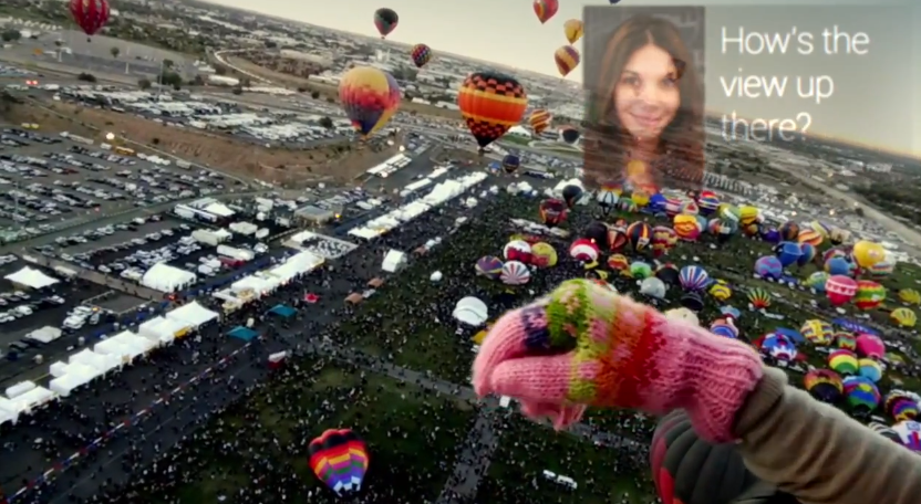
I've been designing for smart glasses for over a year now, including Google Glass and similar products that will be on the market in 2014. I posted my design principles a year ago, but I've evolved them as we've learned from the platform. Here they are: 


Less is More
This commonly seen design principle is never truer than with smart glasses. When you are dealing with a person’s line of sight, you need to take extreme care with every design decision. It’s easy to add features and information, but much harder to take them away because it requires a true understanding of your users and their priorities.
In the design of Skylight, we took extensive measures to drive our user interface down to the absolute minimum while still optimizing its value. Given the industrially oriented environments that we are designing for, we know it is more important to create a minimalist and usable interface than a flashy Iron Man-like interface. This type of thinking led to our Northstar interface, which nests content and features into tiny, unobtrusive virtual points of light. The result is an interface that is almost invisible at times, only revealing itself as the user commands it to.
Don’t Make People Change
Smart glasses are an entirely new type of device. There are no design standards, customer expectations, or market leader to align with. We have no choice but to break new ground and a learning curve is unavoidable.  This doesn’t mean, however, that we have make people change how they behave. We know that if we want to create a usable product, we need to begin with the way that people already act, and design against that.
Very early in our process, we examined common human behaviors, such as how people use mobile devices, write in notebooks, look around their environment, and interact with each other. These everyday activities influenced our design decisions on a daily basis. The result is a product experience that is so unlike anything that’s come before it, yet still familiar. For example, our Northstar head-tracking user interface is based on the concept of visual scanning, the pattern of visually examining an environment for relevant information before focusing in. Actions are then taken by gazing on virtual objects that toggle on and off like light switches. If you know how to look around a room, you know how to interact with Northstar. No hand gestures to learn, no voice commands to remember.
Design for Daily Use
We’ve seen some truly amazing technology demonstrations through the years at conferences and trade shows. If you could step in our R&D lab, you would be floored by the technical feats that our team is capable of. But, we don’t design for demos. We design products for real people to use every day in the workplace. We need to prioritize human factors, like usability, fatigue, and error prevention, in place of more eye-catching features like spinning 3D models with swiping gestures. It was this set of priorities that led to our use of head tracking for interaction. Physical gestures would become far too tiring during a standard work shift and voice input is simply not viable in many industrial environments. Alternatively, head tracking requires so little effort, both physically and mentally, that it emerged as an obvious fit for enterprise scenarios.
Distinguish Glasses from the Real World
One of the advantages of a stereoscopic display is that we can project user interfaces as if they were overlaid on the real world. There are still needs, however, for information to be projected as if it were fixed to the user’s glasses, like a personal heads-up display. In our system, the real world interfaces are designed for interaction using head movements while the personal heads-up display is more “read only” for awareness and notifications. The challenge from a design standpoint is offering the user proper distinction so they immediately and intuitively understand what is a real world element is what is fixed to their display.
We addressed this challenge with slight variations in the design language between the 3D real world and the 2D heads-up display. In our system, real world interface elements have rounded corners and options are primarily circular, offering the intuitive design affordance of a button. This rounded look also blends better into the organic real world. Elements on the 2D heads-up display, by contrast, consist primarily of straight lines and hard angles. This creates a flatter, more prominent, and more “techno-centric” look that is a better fit for a heads-up display. While the edges and shapes may vary, however, the two styles use the same color palette, typography, and other visual cues. The result is a cohesive user interface that exists in two dimensions, resulting in a learnable and usable product experience.
Make a Commitment to Glasses
People will use smart glasses for a reason. Maybe they’re a “desk-less worker” where they want their information in the context of their workplace instead of tied to a fixed location or device. Or, maybe their hands are tied up, carrying packages, using equipment, or treating patients. For these people, we needed to design a completely hands-free user experience. After all, if you need to swipe and tap with your fingers to interact with your glasses, you might as well use a smartphone or tablet.
We made a commitment right from the beginning to “go all in” on glasses. That meant that every behavior, from calling a coworker to taking a picture, needed to be supported without the need for physical interaction. Even our Settings and Registration interfaces are hands free.  We believe this was the right choice for our customer base – people that may be wearing gloves, working in sanitary (or unsanitary!) environments, or simply want the most efficient experience possible.
Provide Convenient Access to Secondary Features
We were presented with a design challenge at a very early stage in the development process. Our Northstar and HUD interfaces worked perfectly together, but it was an incomplete system. What if someone wanted to make a video call, take a photo, or modify user settings? We needed a way to support secondary behaviors quickly and conveniently without obstructing from the primary experience.
We first came up with a concept we called the “personal space” – named for the area below the field of view, close to body, usually reserved for items of personal attention (mobile devices, notebooks, magazines). We figured this to be a natural placement for our configuring and accessing additional content. As we experimented with the technology, our thinking evolved and we learned that the most convenient placement for our menu system was actually above the field of view instead of below. So, we created a truly unique menu interface that is nested just above the user’s normal line of sight. By simply glancing upwards and gazing upon the menu icon, the user is able to open and access a range of hands-free smart glasses features, such as Messages, Contacts, and even a Camera.
Design for Varied Environments
Transparent displays present a significant design challenge as you have no way of predicting what is going to be behind them. Some of our users will be in sun-filled work sites while others will be in dark warehouses. Still others may be moving between the two. We needed to design an interface that could handle these varying environments without any action necessary on the part of the user. We addressed this need by designing a high contrast interface that always presents bright white against dark blue at strategically varying transparencies. As an example, the reticle at the center of the display (i.e. the cursor for head tracking) is a bright white ring that shows up in any normal condition. When looking into a bright environment however, the white ring becomes less apparent and the reticle’s dim blue inner ring visually emerges. Getting these small design details right makes for an interface that can stand up to any condition.
Keep it simple
Since this is such an early-stage technology, everyone that uses our product is going to be a novice to some degree. We have been careful not to overwhelm our users with overly complex rules, difficult to learn interactions, or unnecessary features. The bottom line when designing this type of system: keep it simple.
We have established basic design patterns within our system that we use repeatedly to create an easily learnable and predictable user experience. We have minimized the amount of menu types, buttons, or other interface elements to ensure that people only need to learn a couple things in order to understand the whole system. We have also limited the amount of text, relying instead on familiar graphical icons and visualizations for fast recognition. Finally, we have adhered to a simple color palette that features just a handful of colors that consistently convey specific meanings. The end effect is a perception of simplicity despite the unfamiliarity of this new product paradigm.
Delight
Work is difficult enough for most. They may have long work shifts, hazardous environments, or be faced with endless stress. Utility and usability are our top priorities when designing for these people, but we still believe in the importance of creating an enjoyable product experience as well. While designing Skylight, we took opportunities to design interfaces that were so intuitive that they create a satisfying experience when interacting with them. For example, our lists views can be scrolled like a wheel simply by looking towards the top or bottom of the list. You have never experienced an interface like this before, so the result is honestly fun. We have also designed subtle animations into the interface, such as info panels that slide in-and-out or points of light that animate open like clovers. The intended effect is an interface that seems life-like and interesting to interact with.

Saturday, June 8, 2013

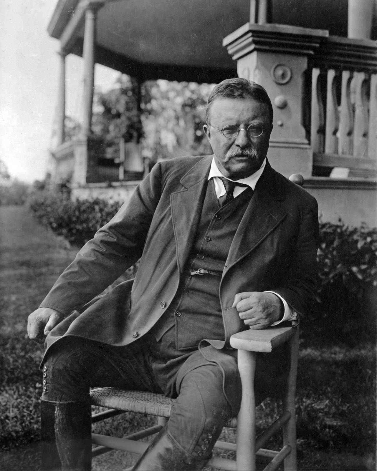
Startup Lessons from Teddy Roosevelt

On April 23, 1910, Theodore Roosevelt gave a speech in Paris entitled "Citizenship In a Republic". You probably aren't famliar with entire speech, but you're likely heard an exerpt of it. This passage is titled "The Man in the Arena". It goes as follows:

"It is not the critic who counts; not the man who points out how the strong man stumbles, or where the doer of deeds could have done them better. The credit belongs to the man who is actually in the arena, whose face is marred by dust and sweat and blood; who strives valiantly; who errs, who comes short again and again, because there is no effort without error and shortcoming; but who does actually strive to do the deeds; who knows great enthusiasms, the great devotions; who spends himself in a worthy cause; who at the best knows in the end the triumph of high achievement, and who at the worst, if he fails, at least fails while daring greatly, so that his place shall never be with those cold and timid souls who neither know victory nor defeat."

I've always liked this quote. I've had a framed hand-written version of it hung on my apartment, office, or home office wall for years now as I've seen it as a good reminder of the importance of hard work and resilience.

Something recently occurred me, however, which is that this passage applies just as well with my work. I'm fortunate enough to work in an environment where my face is not "marred by dust and sweat and blood" but it doesn't mean that there aren't lessons to take from The Man in the Arena.
If you're involved in creating products, particularly if you work at a startup, you know that every day is a test of devotion and resilience. Sure, it's not threat of pain or test of physical endurance, and frankly, the challenge of technology product development is fun if it's your passion. However, that doesn't mean that it's not a measure of continued dedication towards a cause in the face of competition, doubt, and disappointment.

We work in the unknown. We create solutions that we believe will solve important problems when they go to market. We create products that we hope people will want, buy, or need. We aim to make people's lives better. We walk into our offices and start up our computers every day knowing that the ideas and decisions that follow could be the different between success and failure.

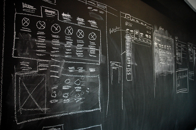
With that, I want to give credit to those who push the ideas forward. I'm talking about any person in any role who has the will to put new ideas out there. Credit goes to the whiteboard sketches, the "programmer art" in MS Paint, as well as the pixel-perfect UI mockup. Credit belongs to the people who are willing to put their reputation on the line, to potentially be proven wrong, by putting new ideas into the world. Credit belongs to the person who steps up to the board and says "what if we did it this way instead?".


Everyone in the startup world knows the importance of prototyping ideas, of experimentation and design iteration, and changing course when defeat is apparent. Ideas are the fuel that powers this engine. We need more people pushing forward and less pushing back. Pushing forward, learning and adjusting course will always win out over over-planning and early negativism.

Of course, we need planning, we need decision-making, and most importantly, we need the "doing" that gets things done. This is all a given. And true, we also need some critique - a good measure of skepticism - but too often this becomes the norm in organizations. This is just people playing it safe and protecting themselves from their fears. It's easy to sit back, to never risk ridicule or reputation, by always pointing out the faults and risks of the work of others. An organization overrun with critics is one where new ideas are welcomed with pessimism and disdain. The result is that the ideas stop coming and the "timid" company pushes forward without knowing "victory nor defeat". I've worked in an organization like this and I can assure you that's a safe but unmotivating existence.


So - push forward. Be the person who steps up to the board and says "how about this?" and proceeds to draw a new future. It doesn't matter what your role is or how creative you think you are. We need more people striving, more people willing to stumble, and more people risking defeat in a worthy cause. We need more people in the arena.  

Thursday, March 28, 2013

Why Structure is the Secret Weapon of Great Design Teams


So you're sitting at your desk in the morning addressing some leftover emails from last night when a message pops up that you're needed in the main conference room. A major client opportunity has come up and the Design team has been asked to whip up some creative concepts. You head to the conference room, sit down with your fellow creatives and the brainstorm begins. After a couple hours of tossing ideas around, the whiteboard is full of ink, including a great sketch of a user journey and a list of a few potentially killer concepts. The meeting ends with you agreeing to document the ideas with the help of some rendered storyboards from one of the better artists in the group. The team will have the new concepts ready for review by the end of the week. Design has delivered. 

This is the model that exists in so many organizations, and it can work just fine. Creatives free of soul-dampening process, temporarily unhindered by reminders of budgetary and technical limits, creating wildly divergent solutions for their less creative counterparts to develop.  

The underlying wisdom is (1) unstructured creative "magic" generates ideas, and then (2) structured engineering process makes the idea of a reality. As far as creating great products, however, it is completely flawed.

The reality is that an unstructured creative process (I'm talking more idea generation than detailed UX design) bounces randomly around the problem and solution spaces, undoubtedly spending too much time on some aspects while accidentally ignoring others. This random approach MAY result in a great outcome, but it's not efficient or reliable as a process.

5 Reasons Why You Need More Creative Structure

1. Trust
If you're a designer, I'm sorry to tell you this but your co-workers don't trust you. They have process and structure. You have whiteboards and brainstorms. They're quantitatively-driven, and you're.... not. By cloaking the creative process and being exclusive, you're creating an unknown that will lead to an uneasiness from people who are not familiar with it. If you want to establish credibility with non-creatives in your organization, you need to have a transparent creative process with a level of rigor that is understood by roles which are traditionally more structured and process-oriented. Otherwise, your work is just "magic" and it will never really be trusted. Sure, you might maintain some of the mystique of being an exclusive design department, and you may generate some fantastic design concepts, but the influence of those concepts will never be fully realized without a considerable level of trust in how they were created. 


2. Ideas
An odd relationship exists between structure and creativity. Bad structure can create a negative environment where brainstorms become more about avoiding constraints than achieving optimal solutions. Good structure can provide a "creative scaffolding" where problems can be more fully understood and the full range of solutions can be explored more effectively. Good structure can also present people with a creative tension that spurs new ways of thinking about problems or generates unexpected solutions. I'm going to focus on the "how" much more in my next post, but an example would be the creation of User Journeys where designers must think through the entire time scale from the initial touchpoint through conclusion. This method promotes a more holistic and comprehensive perspective, which can often reveal unexpected needs or opportunities.
For methods of pure idea creation, check out Dave Gray's "Gamestorming: A Playbook for Innovators, Rulebreakers, and Changemakers" for ideas for creativity-generating games:


3. Communication
A standalone idea is really just an opinion and it is at risk of misinterpretation  When you have a good process however, it is much easier to strengthen your ideas along with the thinking that led to them. For example, I like to define and share the intent behind every design decision. Something like "To make it easy for users to find what they're looking for by providing a Search box". User Journeys are also good at this with their "User Need State" phrases at each step. Verbal statements like these provide a good complement to any visual design, and the combination of the two provide a great talking point. It's the "why" behind the design decision that promotes understanding and acts as a catalyst for conversation.

Well communicated ideas also have a better chance of standing unscathed throughout the product development process. If communicated with intent and reasoning and explanation, design ideas will be more likely understood by the people who are responsible for implementing them. 


4. Product
In my thesis work last year, I discovered that one of the key factors in the success of a company's design strategy was in their ability to take a holistic approach. By this I mean that they clearly considered the entire continuum of their customer touchpoints and developed cohesive product ecocsystems to support them. Designing like this requires a different set of techniques from the earliest ideation stages. It requires a creative framework that is set up for generating ideas across a range of expected user states. The end result should be a series of complementary ideas that form together to create better products and services.

5. Repetition
I recently read the Lean Startup. It took me a while to get around to it becuase I made some incorrect assumptions. I assumed that it was basically "Design Thinking for Startups": rush quickly to a minimum viable product, learn from it, and then iterate. Then I read it and realized that it was much more structured than this. Eric Ries was espousing for scientific rigor in the product development process because it allows for learning and advancement. This is where it separates from Design Thinking. Instead of just being a Way of Thinking, it was a Way of Acting. That's a big distinction.
The benefit of a Way of Acting is that it can be learned, it can be refined, and it can be repeated. The design process should not be an exception to this. Systematic creativity is entirely possible.


Conclusion
To summarize, I believe that design teams would benefit from a more systematic approach to their creative process as it leads to better ideas and a greater chance of realizing those ideas. In the next post, I would like to get into some specific techniques for structured creativity. In the meantime, I would love to hear what has and hasn't worked for you in terms of structuring your creative process. Comment here or fire me an email at toddreily@gmail.com. 

Wednesday, February 27, 2013

Examining the Google Glass #ifihadglass Campaign


Google recently launched a brilliant user research campaign to coincide with their latest annoucements surrounding Google Glass. The campaign asked people to post what they would use Google Glass for if they had one, offering the incentive of the product for the producers of the best ideas. Participants are asked to tag posts on Twitter or Google+ with #ifihadglass.

Of course, the campaign's benefits are numerous, as it solicited ideas from potential customers, generated viral buzz for their product, and took a pulse of their customer perceptions. This final point is what I found to be most interesting. What I was curious about is how people perceive Google Glass, and smart glasses in general. Are they perceived primarily to be an assistance tool that will help you be smarter in your daily life or are they really a recording device for sharing or revisiting your experiences? Of course, smart glasses can and will do all of the above, but what jumps out off as the "I gotta have that!" feature for people?

I decided to leverage Google's #ifihadglass" campaign to attempt to answer this question (Full disclosure: I design user experiences for APX Labs, creators of a smart glasses software platform - check out our latest product video here).  We certainly could have run this study on our own but there is no way to match Google's exposure at this moment, and frankly, this is a faster route to the same answers. After all, we are just talking about perceptions of the tool from people who have not only never used the product, but never used anything like it. Nonetheless, first impressions of what a product IS and what it's FOR can be an interesting data point.

My research plan wasn't particularly rigorous as I don't believe in being overly quantitative when evaluating highly speculative and qualitative feedback. I decided to find and capture 100 #ifihadglass tweets at random that were posted from Feb 22-25 and mark them across a handful of categories. I ignored posts that were clearly jokes or self-promotional. I put the selected posts into a spreadsheet and marked a "1" in each of the relevant categories. The categories were as follows: "Tool" (Input Device), "Capture" (Output/Documentation), and "Share" (Output/Broadcast). If the tweet was about someone wanting to use Glass to help them do their job, for instance, they would get a 1 in the Tool category. If they wanted to use it to document thier kid's life, they would get a mark in the Capture category. If they wanted share their travel experiences, they would get a 1 in the Share category. (Spoiler alert: This final example was by far the most common response.)

Before evaluating the tweets, I also checked the "How It Feels" product video for Glass to see how people may have been influenced in their thinking before submitting thier response. Turns out that Google was pretty balanced, demonstrating 8 scenes where Glass is shown as an Input device, 4 scenes where it is a Capturing device, and 7 scenes where it is a Sharing device. They also feature 7 scenes where there is no UI whatsoever (which was a clever decision by their video designers in my opinion)
So what are the results? Of the 100 #ifihadglass responses that I captured, there were 50 instances of it being percieved as a Sharing device, 39 as an Input device and 15 of it as a Capturing Device (remember that posts could register in multiple categories).

So Glass was primarily perceived as a Sharing device, a theme that appeared in exactly half of the responses. The "share my life/travels/city/job/experiences theme was without a doubt, the most common pattern seen. Again, this is just a perception of how someone would use these, but it's worth noting that the initial response was along the lines of "I want this product so I can share what I do". The self-promotion theme certainly aligns with prevalent trends of today's social tools, where Likes and Follows equate to people feeling self-worth and "mini-fame".

The "Input" responses were not too far behind at 39. Common themes here revolved around the ability to have information readily searchable (e.g. recipes, directions) or have information pro-actively presented in the field of view (e.g. people's names). Finally the "Capture" category got the least hits at only 15. This primarily revolved around people wanting to capture their life/travels/kids for their own purposes.

These results led me to measure an additional comparison, which was people's perception of whether or not this was a device for leisure and entertainment or something much more practical. Of course, people are going to gravitate towards the fun aspect of a product more than mundane one when describing what they would do with it, especially when the Glass promotional video was all about jumping out of planes and flying on trampezes. Nonetheless, it was worth taking this pulse as well. It turns out that 72% of the participants responded that they would use the device for enjoyment purposes while 27% wanted to use it for practical reasons.

The takeaway? Based on Google's communication of their Google Glass product, and based on the current context of the technology world, people are likely perceiving Google Glass as a device for sharing life's moments.... but the question remains, will anyone want to watch those moments?  It will be very interesting to see how actual behavior patterns match up against this predicted behavior.

Is this what you expected? write me with your input! More to come..

Friday, January 11, 2013

10 Important Reminders When Creating Products for People


Every company that makes things or does things for people has the same goal. To get as much money as possible from the people in return for those things. It's amazing how much we over-complicate this some times. But what do what do the people actually want? Even more amazing than our tendancy to over-complicate the formula is to forget that the people have a choice. Throughout my years as a consultant (I'm now back at a product company), I was amazed by the amount of consumer-facing companies that failed to understand their customers and what they actually wanted. They just went about their business, producing thier things, and trying to convince the world of why they should turn over their hard-earned money to get them.

I shouldn't complain or point fingers, because frankly, figuring out what people want is really hard to do. I have a background in Engineering Pscychology, over a decade of experience as a human-centered designer/consultant/director, practically obsess over this goal, and I still find it extremely challenging. Yet, here's the deal.. it's not magic. ANYONE can learn how to better understand thier customers and their needs. ANYONE can get inside the head of a customer to get a better sense of their motivations, frustrations, and biases. This is not just a job for creatives and designers. Everyone on a product team can make better decisions in their job, from business-minded leadership to entry level product engineers, if they have a richer understanding of their customer.

Making the effort to truly understand your customers is worth it. Without a doubt. Competitive analysis might tell you what core features you need to have, but how will you ever separate from the pack doing that? Making the effort to understand the underlying mindset and the behavioral tendencies of your customers will give you some ability to predict what they will and won't want. For instance, good research could tell you that your customers value simplicity over extra features (which they probably do) and high performance over reliability (which they probably don't). Having insights like this can lead to market-changing product ideas, sure, but also just leads to better decision-making throughout the entire product development process.


1. Someone else solved this problem.
Believe your challenge is unique? It's probably not. Abstract the technology or specific domain out of your challenge. Write a simple statement that describes what you're trying to do for people (e.g. "Help people make better purchase decisions"). Then, go find other products or industries that have done this successfully. Learn from them and adapt the best insights.


2. Stop predicting. Start learning.
As much as you research, plan, and discuss your product, you can't predict the future and you have very little idea of how customers are going to react to your product. You're better off getting something in front of users quickly, learn from it, and improve. This is the Lean movement makes sense in the uncertainty of the startup world. It's why IDEO is so bullish on prototyping.

3. Be like Michelangelo.
When asked about how he created his masterpiece, Michelangelo said that all he had to do was "remove all that was not David from the stone". The takeaway? Learning how to subtract unnecessary or unwanted features (and avoiding the temptations of addition) is one of the best paths towards creating a great user experience.

4. Walk in their shoes.
The best insights about users often comes from first-hand experience. If you don't have experience that relates to your user, find a way to come as close as possible. Recreate their environment in an empty lab. If you can, do a bit of ethnographic research by going onsite and just observing them for a whole day with no interruption. You'll be amazed what kind of insights you come away with when you see what their life is really like.

5. Beware the Curse of Knowledge.
You're living this product every day. You have insider knowledge of the technology, awareness of its faults, and you understand the intention behind its design. Because of this, it will be easy to forget what it's like to look at your product with fresh eyes and no preconceptions. Keep yourself honest by constantly showing your ideas to outsiders and seeing how they react. Read the early chapters of Chip and Dan Heath's Made to Stick for more information on The Curse of Knowledge. http://www.amazon.com/Made-Stick-Ideas-Survive-Others/dp/1400064287

6. Ask why... then ask why again.
Intention is the single most important aspect of the design process (to the point where I'm likely writing a book about it). Every feature, every decision, every step should have a "why" behind it that draws back to some human-oriented purpose. If you're questioning the existence of a feature, just keep asking why until you get to the core purpose. If you don't have one, you have more learning to do or you need to cross the feature off the list.

7. You have no clue.
The design process walks a fine line between humility and pride. You need to remember that your ideas or your design can always be better. Feedback, both positive and negative, will help you on the path to a better product. Always question the quality of your design, but have the confidence that you'll get it right. It's a tricky balance but its the only way.

8. Remember the time
It's easy to get tricked into focusing only on the time when someone is using your product. Thinking about your users across a timeline can be an incredibly valuable exercise as it will reveal insights and opportunities. What are your users doing before using your product? What about immediately after? What are they doing most frequently? This last one is particularly important as frequent actions and critical actions are almost never the same, and products should be designed for frequency.

9. Know your surroundings
Your user is not interacting with your product in isolation. Be aware of other products or services or environmental conditions are likely affecting them. Whoever designed my cable box clearly forgot that people have TV's in their bedroom as they decided that bright white LED lights were acceptable, even when the unit is turned off. I had to hack a cover out of a matchbox and I walk across the room and put it on the cable box every night in order for my wife and I to sleep. Not exactly a hardship, but does that sound like something a person does in 2013?

10. People are people
There's a trap that companies often into when it comes to creating products. If they're developing for a specific class of people, they talk of them as if they're some strange foreign species. For instance, they'll talk of military personnel as order-following, extremely-efficient robots or assume that enterprise users care only about productivity and action items. This is wrong and should be stopped. People are people. I'm all for the creation of personas, defining preferences and tendencies, but people are largely the same - they have preferences, they have flaws, and they just want to get their job done and get back to being regular people.


So what's missing from this list? Please comment or write me at toddreily@gmail.com